Landing pages are one tried-and-true way to help ensure that your ads are successfully converting people and moving them through the marketing funnel. The purpose of a landing page is to create a page that acts as the perfect extension of your ad and makes it easy for prospective clients to take an action. When the expert team at Roofing Contractor Marketing designs a landing page there is a lot of consideration that goes into it.
One of the first questions you need to ask yourself is, what ads are going to be driving traffic to this landing page? It is important that the landing page carries on the conversation that is in the ad. For example, it would seem strange if you clicked on an ad about commercial roofing but the landing page had content about homeowners looking for a new roof. The landing page needs to continue the same conversation as the ad.
Another part that is important to consider is the layout and design of the page. If the page is overly crowded visitors may get overwhelmed and click away, or if the layout is hard to follow they may lose interest. A landing page needs to clearly and simply convey the information and give visitors an easy call to action.
At Roofing Contractor Marketing our paid digital team are experts in crafting landing pages that will help maximize your digital ad campaigns conversion rates. That means that your marketing dollars are spent efficiently and effectively to get you the most leads for your spend. If you aren't ready to hand your digital marketing over to our experts here are a few tips from Marketing Land that will help you create better landing pages.
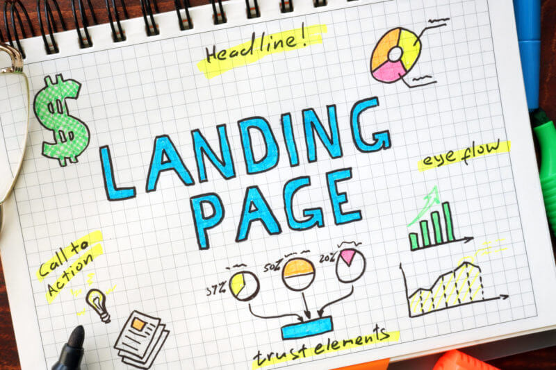
[caption id="attachment_6051" align="aligncenter" width="800"] Are your landing pages optimized to convert?[/caption]
1. Does my above-the-fold experience feel consistent with my advertising?
Your ads set expectations for your landing page. If you’re advertising personal injury services, but your landing page talks about divorce litigation, you immediately create a sense of confusion and unmet expectations for your site traffic. That’s not a great way to get people to convert on your landing page.
Instead, your landing page should match the advertising that brings people to your page. Keep in mind what your ad looks like and promises, along with who you are targeting and what platform your ads are running on. The more seamless your ad-to-landing page transition is, the more likely people are to stick around and potentially convert.
2. Do I have a headline that clearly defines my business and/or offer?
One of the easiest ways to establish a sense of ad-to-landing page consistency is with your headline. Your headline is the first place people look for confirmation that your page matches their expectations. This is the ideal place to confirm what your business does and what your offer is.
Remember, your main goal here is to maintain momentum and build confidence, so keep your headlines clear, concise and focused on the messaging that convinced someone to click on your ad in the first place.
3. Am I communicating value with my headline and subheading?
A good headline and subheading should make a strong value proposition to your potential customers. After all, if you want people to stay and convert, you need to give them a reason to stick around and consider your offer.
The best way to do this is to focus your headline and subheading on how your business or offer will improve the lives of your potential customers. So, instead of saying something generic like “industry-leading software,” it’s better to say something more along the lines of “Close twice as many deals with our sales software.”
4. Is my CTA immediately obvious?
The whole point of a landing page is to help transition potential customers from interest to action. For this reason, landing pages tend to work better if you make the next step immediately obvious. In some cases, you might want an above-the-fold call to action (CTA) encouraging people to convert directly. In others, you may want an above-the-fold CTA that leads people to read more content farther down on your page.
Additionally, it’s almost always a good idea to make your CTA stand out (contrasting colors, smart placement and so on). The easier you make it to find and follow the next step in your conversion path, the more likely people are to do what you want them to do.
Read the full article at marketingland.com...
Originally Posted right here: Is your landing page optimized to convert?


 Are your landing pages optimized to convert?[/caption]